
Judging Books by Their Covers: Graphics and Themes
People might spend more time arguing about graphics than they do arguing about anything else in video games. Every time anything comes out, approximately 5000% of all forum posts are about the graphics being the best ever, or the worst thing since E.T. for the Atari 2600. Graphics have definitely become more complex over the years, but now that designers can make pretty much whatever they’d like, your style of graphics a more a choice than a limitation.

it's like I'm really there. E.T. for the Atari 2600 is one of the games that lead to the great video game crash of 1983 and the graphics certainly didn't help.
But what do the different styles of graphics tell about a game, or theming? Why do designers go with certain styles over others?
Cell shaded graphics are definitely a modern style of graphics that’s come about. Cell shading was made famous by Jet Set Radio for the Sega Dreamcast in 2000. The style allows you to create graphics that resemble a cartoon in 3-dimensions. This is a really cool style which ages well due to how stylized they are. This style is really cool for a number of reasons, not the least of which is because it looks like a damn cartoon. I think lots of kids dreamed about being able to interact with their cartoons, and cell shaded games let you do that. Cell shaded games also have certain air of fun about them. They’re usually colorful, fast paced, and cheerful. The Borderlands series does a great job using its cell shaded graphics to bring some irreverence and fun to the depressing-when-you-think-about-it setting.

So colorful and so depressing to actually think about.
There are certain downsides to the style though. I think it’d be very difficult to make a “serious” cell-shaded game. The style looks best with bright pastel colors, and those generally don’t translate very well to serious subject matter. The contrast between the brightness of the colors and the black outlines doesn’t work nearly as well when the colors are dull. I think you could design a good introspective game, but I don’t know about serious. It’s hard to deal with intensive subject matter when you look like you should be on at Saturday at 9AM.
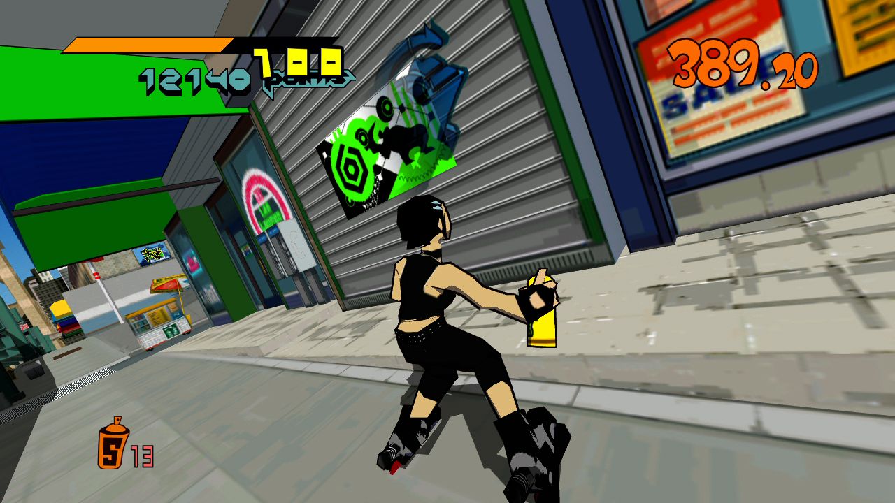
Seriously, this could be a cartoon. I'd watch it. Who doesn't love awesome tunes and roller-skates?
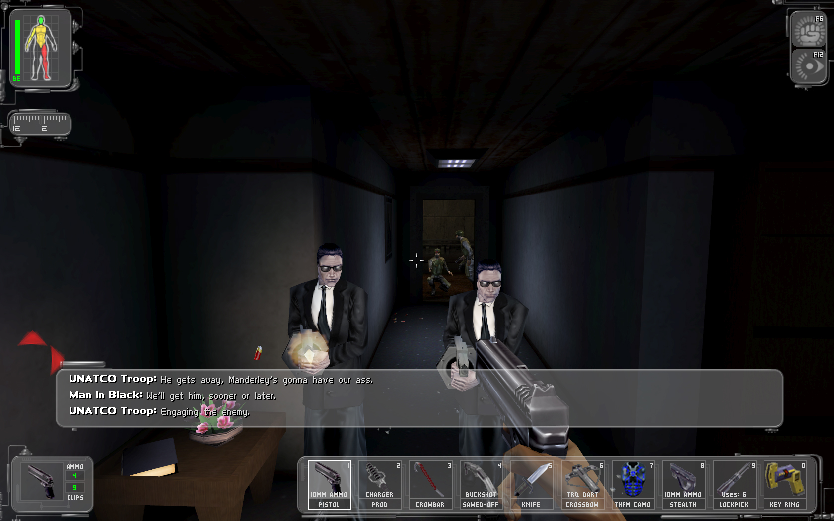
When people think about improved graphics, they usually think about “modern” graphics. I use quotation marks because technology advances and “modern” changes. After all, Deus Ex looked pretty great in 2000, but nowadays it looks pretty ugly and unrefined. The upside to these graphics is that they’re the height of graphics at the time when they came out. They show how much work designers put into their concepts because you can more accurately recreate the drawings in the game. Older games were basically just pixels on top of each other, so some of the nuances of the original ideas might get lost, but the better the graphics, the more accurate the recreation. Better graphics also allow designers to make more detailed worlds

The Crysis series is renowned for it's realistic and demanding graphics. The games look incredible, but in 10 years, maybe they'll look like mud.
The disadvantage to this kind of graphical style is that it ages very poorly. There might be some charm in looking at what was considered the height of graphics in 2004, but Doom 3 looks pretty gnarly these days. Using a modern style of graphics basically ties your game down to a specific era, and can really limit its life, though there are ways around that. People are still making graphical updates for games like Deus Ex or System Shock 2 to help improve their dated looks, but short of a total redesign, the majority of players will pass these games up.

Lastly, we should talk about pixels. The art style, not that terrible movie that came out last year. I’m not actually sure if you can make a good video game movie, to be fair. Seems like most of them are pretty terrible. Well, Silent Hill was actually okay. But man, Pixels was awful.
Where were we? Oh right.
Pixel graphics are what defined classic games, for the most part. There were some other interesting directions that came out at the same time, like vector graphics, but pixels definitely prevailed as the style of the time. Pixel graphics may have started blocky, like in Pong, or most Atari 2600 games, but by the time of Metal Slug pixels became an art form all their own. Detailed pixel art is impressive, not just because it takes forever to make and animate, but because it looks really good. Since pixels dominated for the first 4 generations of gaming consoles, pretty much every kind of game is represented, which means they can be used for any style. Pixels can also be as colorful or as monotone as you’d like them, so they can fit most tones that a game can have. Modern games that use pixel art are usually trying to callback to this classic era of games, and games like Shovel Knight, Axiom Verge, and Titan Souls use their style to great effect this way.

The Metal Slug series is fun, addictive, and beautifully made. The amount of detail in these games is pretty nuts, considering how long it takes to make the art.
There are limitations though. Pixel art is not great for 3D games, with a few exceptions. 3D animation requires sprites to be drawn from a huge number of angles, which is obviously very time consuming and difficult. Pixel art is also not the best for very detailed character faces, without falling on the old JRPG trope of having the characters faces be next to the textbox. It seems like it would be very hard to use pixels as an art style and not bring older games to mind, so if you’re looking for something newer, there are definitely better options.

These sorts of screen really break up the flow of a game and are best left in the past. Star Ocean: Second Evolution has a lot of old fashioned design.
So, we’ve seen how an art style can affect the tone of a game, and the advantages and limitations of a few. This is by no means an exhaustive list, but these are some standouts for sure. When making a game, every piece of it is there for a reason, and trying to figure out why makes the experience so much better. So, next time you’re playing a game, ask yourself why the designers chose the style that they did. What does it add to the game? Was it the best choice?