Let’s Look At: System Shock Pre-Alpha Demo
Disclosure: I have backed this game on Kickstarter to the tune of 30 dollars. I am not paid in any way to talk about this as-yet-unfulfilled-project. Now that we’ve gotten that out of the way, on to our regularly scheduled programming.
Horror and Sci-Fi go together like sleep deprivation and a new parent. Horror aims to inspire fear, which often springs from a lack of understanding. What’s less understood than an alien, or an emotionless artificial intelligence? Horror games add an extra dimension to this trope by giving you control over somebody in such a situation. System Shock (1994) took HAL 9000 and cranked the terror up to 11, later inspiring games like Bioshock and SOMA. Unfortunately, System Shock hasn’t aged well. The control scheme is maximalist beyond words, with no mouselook. The graphics, music, and enemy sound design maintain a certain spooky charm, but the voice acting sounds more bored than terrified. The folks over at Nightdive Studios decided that enough was enough and that they were going to remake the original cyberpunk horror experience. They recently released a pre-alpha demo, so let’s see where it’s going.
I’m not sure if they’re keeping the original story, but it bears repeating because it’s awesome. In 2072, you (a hacker wearing a funny shirt) hack into the TriOptimum Corporation database to learn about Citadel Station. You are brought before a TriOptimum executive who promises to clear all charges against you if you hack the Station A.I. SHODAN to give him control over it. He even promises to throw in a valuable (and illegal) military grade neural implant.
You hack SHODAN and hand control over to the executive and they implant some tech in your head, you take a 6 month healing nap. You wake up to find that SHODAN has taken control of the station, reprogrammed all the robots, and killed, mutated, and transformed the human occupants of the station. You quickly learn Citadel Station’s mining laser is charging and that SHODAN is planning to destroy all of Earth’s major cities. Time to go stop a super powerful artificial intelligence with total control of a space station. Off you get.
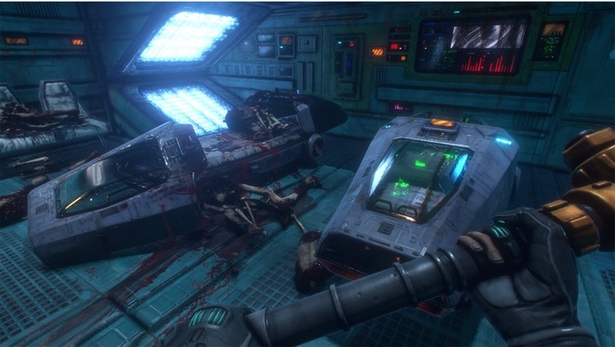
The demo starts out much like the original, with you waking up in an abandoned station. Right off the bat, the visual style of the remake is beautiful. Nightdive Studios have maintained the original layout of the Citadel Station, but they’ve also created a modern and sensible new look. Gas and bits of fog filter across your vision as neon lights of every shade emanate from the various screens and touchpads.
The particle effects are impressive in their own right; lightning jumps out of power stations and jumps around your gloved hand, sparks fly from your weapon impact on a robot, and your electro-gun unleashes bolts of blue electricity that leave glowing orange scorch marks. All together it creates a very cohesive and mysterious cyberpunk feeling. While most things remain the same the remake has made the game a little darker, lighting wise. The original was very bright, even pastel colored at times, which didn’t mesh with the tone.
The movement of your character is appropriately slow, just like the original game, but with a lot more kinetic feeling. When picking up an important item or weapon, your character flips it around in their hands for a minute, looking at it before putting it away or wielding it. It’s a nice bit of real-world curiosity that gives a lot of character to your silent protagonist.
It makes sense that you’d be curious; you did hack into a super powerful corporation’s files just for shits’n’giggles. Swinging your weapon has the kind of weight that the swing of a real pipe might; impact feels satisfying and blows land with a good thunk. Climbing up and down ladders isn’t instant, like in Half-Life 2, but a process of getting on and off that reinforces the weight your character has. All in all, it feels like movement in a horror game should.
The original System Shock was very text based and the remake brings a little bit of that magic back with frequent on-screen messages. When your character opens a box a line of text will appear, as if somebody was typing it, that scrolls across the middle of your screen: “I wonder what’s inside?”. When you attempt to interact with a computer screen texture, you’ll get a message of “It’s all gibberish.” Intractable items will have an augmented-reality like circle around them, mimicking the look of the original game and modern augmented reality devices.
Given that this is a demo designed to get people to invest in a game that doesn’t exist yet, Nightdive studios is trying to put their best foot forward. With any such attempt, you’re bound to stumble a bit. Some of the issues I have with this demo can definitely be fixed, but we’ll see what happens. First of all, it’s hard to tell if an enemy is close enough to hit you. I think this is an issue related to your field of view and the difficult nature of melee combat in first person, but it’s a bit annoying. I always end up backing up and charging toward enemies like some kind of indecisive Roomba.
One of your weapons, which I’m calling the Electrogun (because I don’t know it’s name), has several power modes which you can switch between. Each level corresponds to a different amount of electricity you use per shot and damage you do. Each time you change the level, an animation plays where your character raises the gun in front of their/your face and turns the little knob on the side of the gun that changes the power.
Thing is, it’s really hard to see which level you’ve just turned to and there’s no indication anywhere else on the screen. There’s little markings next to the different settings on the gun, but other parts of the gun and your hands obscure the markings when you’re turning the knob. If other weapons have this style of alteration, I hope Nightdive adds an indication somewhere else on the screen to let you know which power level you’re on.
System Shock had a wonderful and atmospheric soundtrack that added a lot to the eerie feelings that the game evoked. The demo doesn’t seem to have a soundtrack, aside from a short orchestral number as you look out a window. While I’m not sure if the original 90s cyberpunk soundtrack would fit with the darker visual choices Nightdive has made, I think a reimagining of the original soundtrack would be a good idea. From what I’ve seen, a full soundtrack is planned, but I hope they go with something with an outrun style bent. I think the Neo-80’s sound would work well with the more neon visual style.
Worth Playing/Worth Backing?
Yes/Maybe
This demo is definitely fun, visually well designed, and atmospheric. There are some issues around sound, enemy attacks, and unclear mechanics, but the whole package is a great throwback to a different era of game. However, if you were not a fan of the original game’s tone, atmosphere, or speed, you might not want to back this one. This game is not Bioshock, or even System Shock 2. It’s slower and not and RPG, though that could change with one of the kickstarter’s stretch goals. If you liked the original, then I would suggest backing this one.
Share this article with friends, enemies, relatives, and anybody else. They need this super ultra-important information about an almost completely funded videogame on Kickstarter.
Don’t forget to follow TheMagnusKit on Facebook and Twitter for more helpful tips on how to beat sentient, hyper-intelligent artificial intelligences.


